
Canva Class Link
Add Pictures
Photos
<div class="img-container">
<img src="./images/A-Cat.jpg" />
</div>
<div class='three-cats'>
<img src="./images/A-Cat.jpg" />
<img src="./images/A-Cat.jpg" />
<img src="./images/A-Cat.jpg" />
</div>
<div class="example-section">
<div class="txt-content">
<h2>my image headline</h2>
<p>Stuff I wrote about my image thats super interesting
Stuff I wrote about my image thats super interesting
Stuff I wrote about my image thats super interesting
Stuff I wrote about my image thats super interesting
</p>
</div>
<div class='img-content'>
<img src="./images/A-Cat.jpg" />
</div>
</div>
</body>
<style>
.img-container img {
width: 300px;
height: 300px;
display: block;
}
.three-cats {
display: block;
}
.three-cats img {
display: inline-block;
width: 300px;
}
.example-section {
width: 100%;
display: inline-block;
}
.example-section .txt-content, .example-section .img-content {
width: 40%;
display: inline-block;
}
.example-section .img-content img {
width: 300px;
display: inline-block;
}
.txt-content h2 {
text-align: center;
text-transform: uppercase;
}
.txt-content p {
width: 250px;
text-align: center;
margin: auto;
}
</style>
Webpage
<!DOCTYPE html>
<html lang="en">
<head>
<title>CSS Template</title>
<meta charset="utf-8">
<meta name="viewport" content="width=device-width, initial-scale=1">
<style>
* {
box-sizing: border-box;
}
body {
font-family: Arial, Helvetica, sans-serif;
}
/* Style the header */
header {
background-color: #666;
padding: 30px;
text-align: center;
font-size: 35px;
color: white;
}
/* Create two columns/boxes that floats next to each other */
nav {
float: left;
width: 30%;
height: 300px; /* only for demonstration, should be removed */
background: #ccc;
padding: 20px;
}
/* Style the list inside the menu */
nav ul {
list-style-type: none;
padding: 0;
}
article {
float: left;
padding: 20px;
width: 70%;
background-color: #f1f1f1;
height: 300px; /* only for demonstration, should be removed */
}
/* Clear floats after the columns */
section::after {
content: "";
display: table;
clear: both;
}
/* Style the footer */
footer {
background-color: #777;
padding: 10px;
text-align: center;
color: white;
}
/* Responsive layout - makes the two columns/boxes stack on top of each other instead of next to each other, on small screens */
@media (max-width: 600px) {
nav, article {
width: 100%;
height: auto;
}
}
</style>
</head>
<body>
<h2>CSS Layout Float</h2>
<p>In this example, we have created a header, two columns/boxes and a footer. On smaller screens, the columns will stack on top of each other.</p>
<p>Resize the browser window to see the responsive effect (you will learn more about this in our next chapter - HTML Responsive.)</p>
<header>
<h2>Cities</h2>
</header>
<section>
<nav>
<ul>
<li><a href="#">London</a></li>
<li><a href="#">Paris</a></li>
<li><a href="#">Tokyo</a></li>
</ul>
</nav>
<article>
<h1>London</h1>
<p>London is the capital city of England. It is the most populous city in the United Kingdom, with a metropolitan area of over 13 million inhabitants.</p>
<p>Standing on the River Thames, London has been a major settlement for two millennia, its history going back to its founding by the Romans, who named it Londinium.</p>
</article>
</section>
<footer>
<p>Footer</p>
</footer>
</body>
</html>
RWS Meta tag for each page (header section)
<meta name="viewport" content="width=device-width, initial-scale=1.0">
<meta name="viewport" content="width=device-width, initial-scale=1.0">
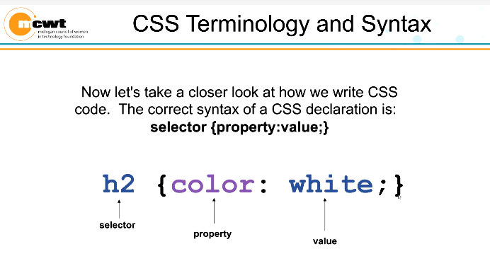
COLOR CSS
RESET CSS FILE
/* http://meyerweb.com/eric/tools/css/reset/
v2.0 | 20110126
License: none (public domain)
*/
html, body, div, span, applet, object, iframe,
h1, h2, h3, h4, h5, h6, p, blockquote, pre,
a, abbr, acronym, address, big, cite, code,
del, dfn, em, img, ins, kbd, q, s, samp,
small, strike, strong, sub, sup, tt, var,
b, u, i, center,
dl, dt, dd, ol, ul, li,
fieldset, form, label, legend,
table, caption, tbody, tfoot, thead, tr, th, td,
article, aside, canvas, details, embed,
figure, figcaption, footer, header, hgroup,
menu, nav, output, ruby, section, summary,
time, mark, audio, video {
margin: 0;
padding: 0;
border: 0;
font-size: 100%;
font: inherit;
vertical-align: baseline;
}
/* HTML5 display-role reset for older browsers */
article, aside, details, figcaption, figure,
footer, header, hgroup, menu, nav, section {
display: block;
}
body {
line-height: 1;
}
ol, ul {
list-style: none;
}
blockquote, q {
quotes: none;
}
blockquote:before, blockquote:after,
q:before, q:after {
content: '';
content: none;
}
table {
border-collapse: collapse;
border-spacing: 0;
}
DIV TAG SECTIONS
https://www.w3schools.com/html/html_div.asp
<div id="banner" class="row"
<div class="col-12>Banner/Title</div>
<div>
<div id="navigation" class="row"
<div class="col-12>Navigation Buttons</div>
<div>
<div id="main Idea" class="row"
<div class="col-6>Main Idea1</div>
<div>
<div id="content" class="row"
<div class="col-4">Photo</div>
<div class="col-8">Content</div>
</div>
MCWT Instructional Folders
STYLE.CSS
* {box-sizing: border-box;}
.col-1 {width: 8.33%;}
.col-2 {width: 16.66%;}
.col-3 {width: 25%;}
.col-4 {width: 33.33%;}
.col-5 {width: 41.66%;}
.col-6 {width: 50%;}
.col-7 {width: 58.33%;}
.col-8 {width: 66.66%;}
.col-9 {width: 75%;}
.col-10 {width: 83.33%;}
.col-11 {width: 91.66%;}
.col-12 {width: 100%;}
[class*="col-"] {
float: left;
padding: 15px;
border: 1px solid red;
}
.row::after {
content: "";
clear: both;
display: table;
}
Background Image
background: url(../images/Chat.jpg) no-repeat center center fixed;
-webkit-background-size: cover;
-moz-background-size: cover;
-o-background-size: cover;
background-size: cover;
<!DOCTYPE html>
<html>
<head>
<style>
body {
background-image: url('img_girl.jpg');
background-repeat: no-repeat;
background-attachment: fixed;
background-size: cover;
}
</style>
</head>
<body>
<h2>Background Cover</h2>
<p>Set the background-size property to "cover" and the background image will cover the entire element, in this case the body element.</p>
</body>
</html>
